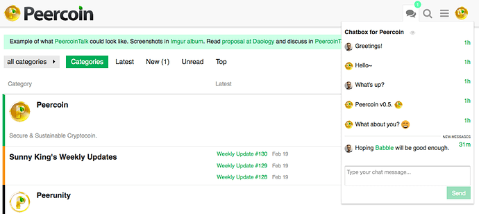
I like the chat button and its placement, but I find the red distracting while trying to read longer posts. I would prefer a more neutral color.
th nubit gold?
1 Like
I also support NuGold #ffb800
Okay I changed it. I think eventually we’ll just make it a button up at the top somewhere. Maybe a quote bubble icon next to the rest of the icons at the top right. Hopefully this is better for the time being. I still think it’s kinda bright though. I’m traveling at the moment so I don’t know when I’ll be able to update the placement.
I’d like that. The current button is placed behind the navigator on narrower displays (iPad, iPhone), and behind the editor on all my devices.
I think fa-comments is a suitable chat icon.
Yeah I agree. Sorry about that. I’ll see when I can get a chance to fix it.
